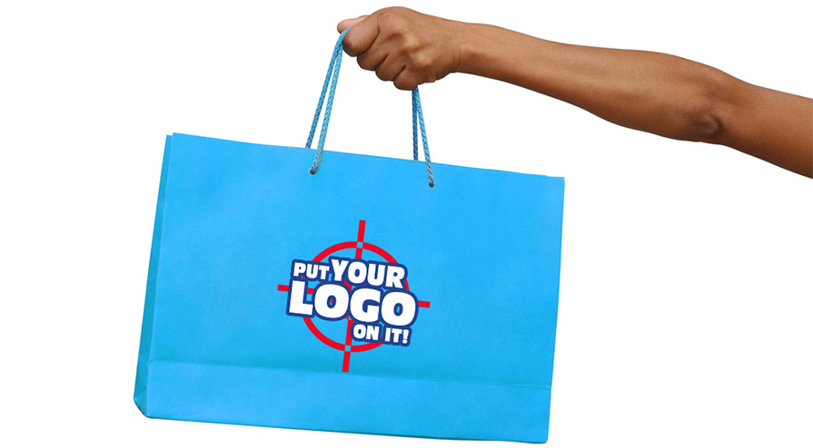
When you want to print custom tote bags in Canada, whether it is for business, promotional needs or you’re creating them to represent a group such as a hobby club, it is always important to think about the design you want. It is fairly common that the design on tote bags usually consists of a single or multiple logos. If you want your custom logo design to truly stand out, here are some tips you should consider:
Too cliche
Don't simply copy your logo design off some other designs you have seen on the net. If you want your tote bags to stand out, make the logo as unique as possible. For example, so many "Stay Calm and Carry On" variation types of logos have come out in the recent past. And we truly feel it’s time to move on! Try to avoid basic archetypes and start the trend yourself.
Keeping it simple
Actually, it is not easy to keep things minimalistic at times. We are not saying that you should just do some custom lettering and be done with that. Simple does not mean mundane or boring. Simple means getting your point across in one clean sweep. Some designers actually design many elements in one logo, making it hard to come to life on a tote bag. When there are too many complicated design elements in one logo, it will also make it hard for any viewer to focus on the logo and understand what you are trying to portray.
Think about the negative space
When you create your custom logo design, think about what the negative space can do. You can make your message subtle and intrigue everyone.

A good example here is the FedEx logo. We bet you‘ve seen the FedEx logo so many times but haven’t realized that there is an arrow in the negative space created by the letters "Ex". So if you want to take it to another level, think about the negative space in your design!

Colour matters!
We all know that colours can communicate hidden meanings and enhance your underlying ideas. Use the colour palette to your advantage and choose appropriate colours for your logo design. For example, if you are printing tote bags for a green campaign, go for calmer or earth tones that can help communicate this point. Sometimes, going for greyscale can be equally effective, if your design has many solid lines. The best advice here is to always remember what you want your logo to do for your tote bags, and choose the colours accordingly.
Placement of your logo on the tote bag
Of course, the hot favourite spot to print the logo is somewhere in the center towards the lower half for tote bags. But you don't have to follow everyone else if you want your logo to stand out on your custom tote bags. Well, if your logo includes longer wordings or a more linear design, how about printing the logo vertically downwards on the right side of the tote bags? Make it unique but what's more important here is that you have to consider when a user is carrying the tote bag, will the logo be hidden from sight? After all, if your logo is not very visible, it defeats the purpose of having it there in the first place!


