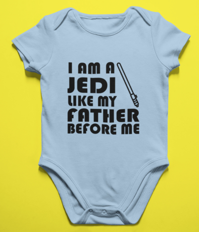
We’re all for creating an incredible graphic for your personalized t-shirt design. We even curated this list of tools you can use to make awesome graphics when you don’t have a designer on your team. But often we forget about a key design element that can make an enormous impact on how your custom apparel is perceived – typography!
Typography is how you display your lettering to ensure it looks appealing to the viewer. Selecting the right font style can help evoke certain emotions and tell your brand story with just one glance at your custom logo or design.
Font styles are endless and graphic designers spend years studying the fine art of typography. But don’t let that scare you! Before we get into choosing a font, here are a few things you should consider before selecting.
Get into Your Feelings
One of the best ways to find your perfect font is to match your font to the emotion that you want to convey. Whether you are designing a minimalist style text-only custom t-shirt or if you are integrating a graphic with your text, your font should match the emotion you want people to feel when they look at your design.
Take a moment to list all the emotions and adjectives you want to be associated with your brand. What qualities do you want your design to communicate? Are you serious or playful? Classic and timeless or modern and futuristic? Keeping these in mind will help make your choice much smoother.
Ace the Reading Test
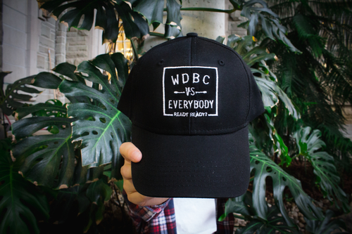
It may seem obvious, but you also want to make sure that the text in your design is perfectly legible. Be sure to choose a font that best suits the size and scale of your design. For example, your font choice for a full front printed t-shirt design would be very different for a smaller design on custom hats.
Consider the purpose of your design and where it will be seen? Will your customized t-shirt design only be seen in person or will it be online as well? Will it be a small left chest, hat design or a large t-shirt or sweater design?
The Font Guide
Now that you have all your design considerations, let’s get into the main event – choosing a font! Here is a guide to basic font types and the best uses for each.
Serifs
Any student who has written an essay in Time New Roman, 12-point font is all too familiar with serif fonts. Serif fonts are the tried-and-true classics of the typography world. These fonts have little “feet” on the ends of the letters which make for a timeless design. These fonts can be perceived as more traditional or even historical, and do not typically go well on digital displays.
Due to the antique-like feel of these fonts, they are often used by long-standing publications like the New York Times or by academic institutions like the University of Toronto.

Serif fonts are great for classic, prestigious brands and for academic and thoughtful displays of communication.
For this look, consider using: Libre Baskerville, Noto Serif, Quattrocento
Sans serifs
Stylish and streamlined, sans serif fonts (meaning “without serif”) started becoming more popular with the rise of screen-based technology. Sans serifs have clean line endings without the extra “feet” that serifs have.
While these may not be as attention-grabbing as a script or display font, sans serifs are clean and extremely easy to read. They are great for secondary or body text and are often used by technology companies like Apple, who want to give the impression of modern simplicity.

For this look, consider using: Average Sans, Open Sans, Source Sans Pro
Scripts
Script fonts are characterized by fluid, connecting letters. These fonts give the impression of a handwritten text which can make the design feel more personal. Scripts can be both formal and casual. Formal scripts look graceful and elegant, like the Cadillac logo. Casual scripts are playful and contemporary like Cadbury.
Regardless of whether it is formal or casual, a script font can add personality to a design. But it’s important to note that scripts do not work for all types of design. Long and small portions of text written in a script tend to be difficult to read and look squished. You should also never use a script for text you want in all caps – as this also becomes hard to read.
For this look, consider using: Allura, Damion, Sacramento
Display fonts
Decorative or display fonts are highly stylized typefaces that are designed to catch the viewer’s attention. Typically, these fonts revolve around specific themes like historical eras or even films.
An example of a very well-known display font is Comic Sans. While these typefaces can be fun and have a lot of personality, they should be used in moderation.
Try to use these eye-catching fonts for large titles and never as body text.
For this look, consider using: Chewy, Ewert, Fredericka the Great

Putting it Together
Now that you know all the font types you can work with, test them out! Design your own t-shirt with different typefaces and see which one best suits you and your design.
All the font recommendations listed above are available in our Design Studio for you to experiment and visualize your custom printed t-shirts. Don’t forget to tweet at us to let us know which font you liked best. Happy Designing!


